점선 테두리 점 사이의 간격을 늘리는 방법
나는 내 상자에 점선 스타일의 테두리를 사용하고 있습니다.
.box {
    width: 300px;
    height: 200px;
    border: dotted 1px #f00;
    float: left;
}
테두리의 각 점 사이의 간격을 늘리고 싶습니다.
이 방법은 수평 및 수직 경계에 모두 적용됩니다.
/*Horizontal*/
background-image: linear-gradient(to right, black 33%, rgba(255,255,255,0) 0%);
background-position: bottom;
background-size: 3px 1px;
background-repeat: repeat-x;

/*Vertical*/
background-image: linear-gradient(black 33%, rgba(255,255,255,0) 0%);
background-position: right;
background-size: 1px 3px;
background-repeat: repeat-y;
크기는 배경 크기로, 비율은 선형 구배 백분율로 조정할 수 있습니다.이 예제에서는 점선 1px 점선과 간격 2px 점선을 사용합니다.이렇게 하면 여러 배경을 사용하여 여러 점선 테두리도 가질 수 있습니다.
이 JSFiddle에서 시도해보거나 코드 스니펫 예제를 살펴봅니다.
div {
  padding: 10px 50px;
}
.dotted {
  border-top: 1px #333 dotted;
}
.dotted-gradient {
  background-image: linear-gradient(to right, #333 40%, rgba(255, 255, 255, 0) 20%);
  background-position: top;
  background-size: 3px 1px;
  background-repeat: repeat-x;
}
.dotted-spaced {
  background-image: linear-gradient(to right, #333 10%, rgba(255, 255, 255, 0) 0%);
  background-position: top;
  background-size: 10px 1px;
  background-repeat: repeat-x;
}
.left {
  float: left;
  padding: 40px 10px;
  background-color: #F0F0DA;
}
.left.dotted {
  border-left: 1px #333 dotted;
  border-top: none;
}
.left.dotted-gradient {
  background-image: linear-gradient(to bottom, #333 40%, rgba(255, 255, 255, 0) 20%);
  background-position: left;
  background-size: 1px 3px;
  background-repeat: repeat-y;
}
.left.dotted-spaced {
  background-image: linear-gradient(to bottom, #333 10%, rgba(255, 255, 255, 0) 0%);
  background-position: left;
  background-size: 1px 10px;
  background-repeat: repeat-y;
}
<div>no
<br>border</div>
<div class='dotted'>dotted
<br>border</div>
<div class='dotted-gradient'>dotted
<br>with gradient</div>
<div class='dotted-spaced'>dotted
<br>spaced</div>
<div class='left'>no
<br>border</div>
<div class='dotted left'>dotted
<br>border</div>
<div class='dotted-gradient left'>dotted
<br>with gradient</div>
<div class='dotted-spaced left'>dotted
<br>spaced</div>여기 제가 최근 프로젝트에서 사용한 수평적인 경계로 제가 원하는 거의 모든 것을 달성하기 위한 속임수가 있습니다.사용합니다.<hr/>수평 경계가 필요할 때마다 말입니다이 시간에 경계선을 추가하는 기본적인 방법은 다음과 같습니다.
hr {border-bottom: 1px dotted #000;}
하지만 만약 여러분이 경계선을 통제하고 점 사이의 간격을 늘리고 싶다면, 다음과 같은 것을 시도해 볼 수 있습니다.
hr {
height:14px; /* specify a height for this hr */
overflow:hidden;
}
다음에서는 테두리를 작성합니다(여기 점이 있는 예제가 있습니다).
hr:after {
content:".......................................................................";
letter-spacing: 4px; /* Use letter-spacing to increase space between dots*/
}
이는 점, 그라디언트 등에 텍스트 음영을 추가할 수 있음을 의미하기도 합니다.원하는 건 뭐든...
수평적인 경계면에서는 정말 효과적입니다.수직이 필요한 경우 다른 hr에 대한 클래스를 지정하고 CSS3를 사용할 수 있습니다.rotation소유물.
순수 CSS로는 할 수 없습니다. CSS3 사양에는 이에 대한 특정 인용문도 있습니다.
참고: 점과 대시의 간격, 대시의 길이에 대한 통제는 없습니다.모서리가 대칭이 되는 간격을 선택하는 것이 좋습니다.
그러나 테두리 이미지 또는 배경 이미지를 사용하여 트릭을 수행할 수 있습니다.
이것은 표준 CSS 테두리와 의사 요소+오버플로우:숨김을 사용합니다.예제에서는 3개의 서로 다른 2px 점선 경계를 얻을 수 있습니다. 일반, 5px와 같은 간격, 10px와 같은 간격입니다.실제로 10-8=2개의 px만 있는 10개의 px가 보입니다.
div.two{border:2px dashed #FF0000}

div.five:before {
  content: "";
  position: absolute;
  border: 5px dashed #FF0000;
  top: -3px;
  bottom: -3px;
  left: -3px;
  right: -3px;
}

div.ten:before {
  content: "";
  position: absolute;
  border: 10px dashed #FF0000;
  top: -8px;
  bottom: -8px;
  left: -8px;
  right: -8px;
}

div.odd:before {left:0;right:0;border-radius:60px}

div {
  overflow: hidden;
  position: relative;


  text-align:center;
  padding:10px;
  margin-bottom:20px;
}
<div class="two">Kupo nuts here</div>
<div class="five">Kupo nuts<br/>here</div>
<div class="ten">Kupo<br/>nuts<br/>here</div>
<div class="ten odd">Kupo<br/>nuts<br/>here</div>크고 둥근 모서리를 가진 작은 요소에 적용하면 재미있는 효과를 얻을 수 있습니다.
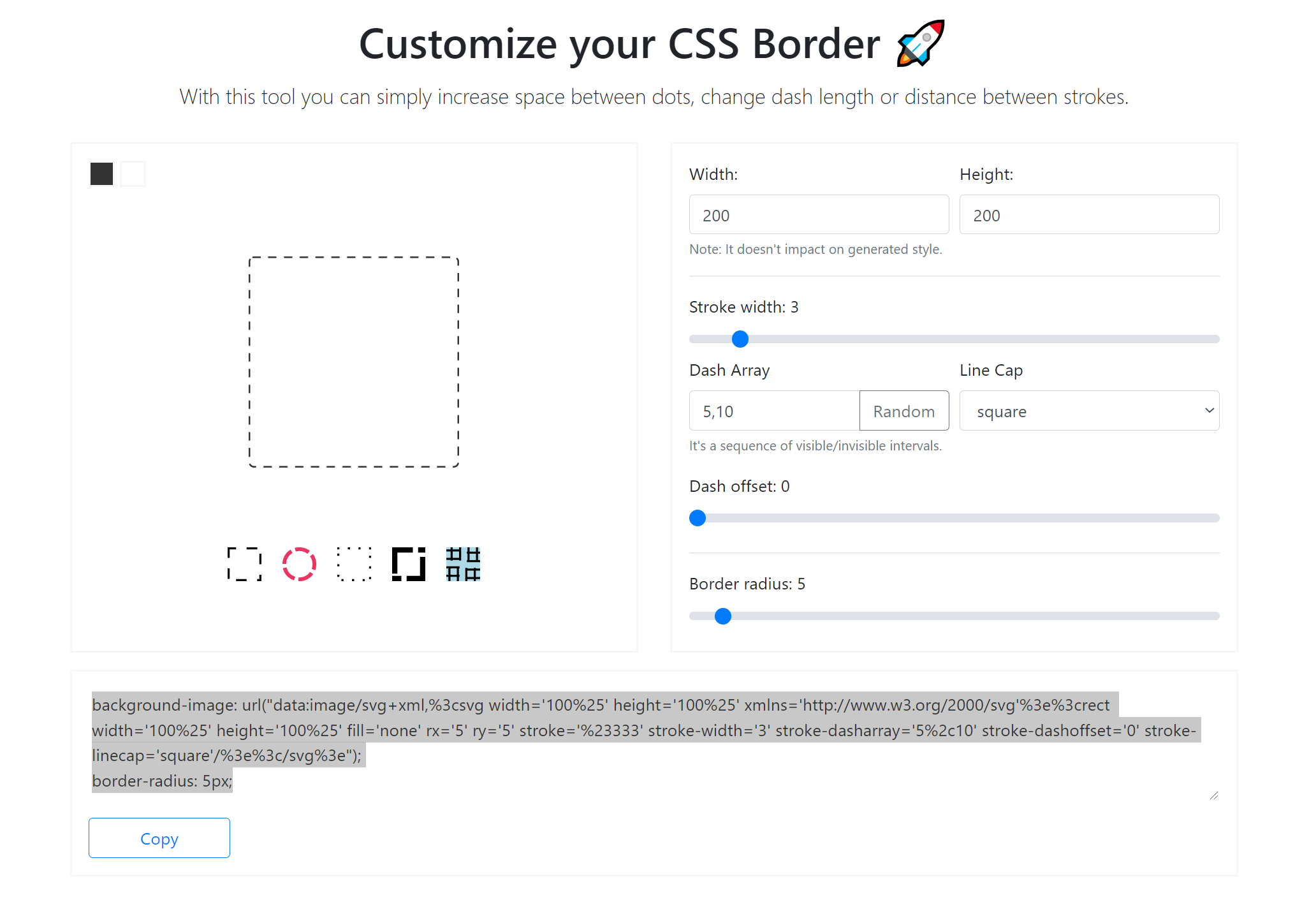
파티에 늦었지만 인터넷에서 그 깔끔한 도구를 발견했습니다.
https://kovart.github.io/dashed-border-generator/
따라서 주어진 답변부터 시작해서 CSS3가 여러 설정을 허용한다는 사실을 적용하는 것 - 아래 코드는 완전한 상자를 만드는 데 유용합니다.
#border {
  width: 200px;
  height: 100px;
  background: yellow;
  text-align: center;
  line-height: 100px;

  background: linear-gradient(to right, orange 50%, transparent 0%) top repeat-x,
    linear-gradient(blue 50%, transparent 0%) right repeat-y,
    linear-gradient(to right, green 50%, transparent 0%) bottom repeat-x,
    linear-gradient(red 50%, transparent 0%) left repeat-y;
  background-size: 10px 1px, 1px 10px;
}
<div id="border">
bordered area
</div>배경 크기의 10px는 대시와 갭이 커버할 면적을 제공한다는 점에 주목할 필요가 있습니다.배경 태그의 50%는 대시의 실제 너비입니다.따라서 각 테두리 면에 길이 대시가 다를 수 있습니다.
사용 가능한 값은 MDN 문서를 참조하십시오.border-style:
- none : 테두리 없음, 너비를 0으로 설정합니다.기본값입니다.
- hidden : 테이블 요소에 대한 경계 충돌 해결 측면을 제외하고는 'none'과 동일합니다.
- dashed : 일련의 짧은 대시 또는 선 세그먼트입니다.
- 점선 : 일련의 점.
- double : 테두리 너비로 정의된 픽셀 양까지 합치는 두 개의 직선.
- 그루브 : 조각효과.
- inset : 상자가 내장된 것처럼 보입니다.
- intet : intet의 반대입니다.상자를 3D(엠보싱)로 표시합니다.
- ridge : 'groove'의 반대쪽.테두리가 3D(커밍아웃)로 나타납니다.
- 솔리드 : 싱글, 스트레이트, 솔리드 라인
그러한 선택 이외에는 표준 국경의 스타일에 영향을 줄 방법이 없습니다.
만약 당신이 좋아하는 가능성이 없다면 CSS3를 사용할 수 있지만, 이에 대한 브라우저 지원은 여전히 매우 부족합니다(EDIT: 브라우저 지원은 2020년 현재 좋습니다).
이것은 오래된 주제이지만 여전히 매우 관련성이 있는 주제입니다.현재 상위 정답은 매우 작은 점에 대해서만 잘 작동합니다.보젠드라 라우니야르가 댓글에서 이미 지적했듯이 더 큰 점(>2px)의 경우 점이 둥근 것이 아니라 정사각형으로 나타납니다.저는 이 페이지에서 띄어쓰기가 아닌 띄어쓰기가 있는 점(또는 일부 답변에서 사용하는 대시)을 검색했습니다.
이것을 바탕으로 나는, 나는.radial-gradient. 또한 Ukuser32의 답변을 이용하면 점 속성을 네 개의 테두리 모두에서 쉽게 반복할 수 있습니다.모서리만 완벽하지 않습니다.
div {
    padding: 1em;
    background-image:
        radial-gradient(circle at 2.5px, #000 1.25px, rgba(255,255,255,0) 2.5px),
        radial-gradient(circle, #000 1.25px, rgba(255,255,255,0) 2.5px),
        radial-gradient(circle at 2.5px, #000 1.25px, rgba(255,255,255,0) 2.5px),
        radial-gradient(circle, #000 1.25px, rgba(255,255,255,0) 2.5px);
    background-position: top, right, bottom, left;
    background-size: 15px 5px, 5px 15px;
    background-repeat: repeat-x, repeat-y;
}
<div>Some content with round, spaced dots as border</div> radial-gradient 예상:
- 모양과 임의의 위치
- 두 개 이상의 정지: 색상 및 반지름
여기서 저는 도트 사이의 지름(10px)의 2배인 5픽셀 지름(2.5px 반경)의 도트를 원했고, 도트 사이의 지름(10px)은 15px까지 더했습니다.background-size이것들과 일치해야 합니다.
두 정지점은 점이 착하고 매끄럽게 정의됩니다. 즉, 반지름의 반은 검은색, 전체 반지름은 경사보다 검은색입니다.
@Eagorajose의 답변을 바탕으로 4엣지 솔루션 구축 및 속기 구문 적용:
background: linear-gradient(to right, #000 33%, #fff 0%) top/10px 1px repeat-x, /* top */
linear-gradient(#000 33%, #fff 0%) right/1px 10px repeat-y, /* right */
linear-gradient(to right, #000 33%, #fff 0%) bottom/10px 1px repeat-x, /* bottom */
linear-gradient(#000 33%, #fff 0%) left/1px 10px repeat-y; /* left */
#page {
    background: linear-gradient(to right, #000 33%, #fff 0%) top/10px 1px repeat-x, /* top */
    linear-gradient(#000 33%, #fff 0%) right/1px 10px repeat-y, /* right */
    linear-gradient(to right, #000 33%, #fff 0%) bottom/10px 1px repeat-x, /* bottom */
    linear-gradient(#000 33%, #fff 0%) left/1px 10px repeat-y; /* left */

    width: 100px;
    height: 100px;
}
<div id="page"></div>이것은 정말 오래된 질문이지만 구글 순위가 높아서 당신의 요구에 따라 작동할 수 있는 저의 방법을 도입하려고 합니다.
저 같은 경우에는 대시 사이에 최소한의 틈이 있는 두꺼운 대시보드를 원했습니다.CSS 패턴 생성기(이것처럼: http://www.patternify.com/) )를 사용하여 가로 px, 세로 px 패턴을 만들었습니다. 그 px은 솔리드 대시 컬러, px은 흰색입니다.
저는 CSS에 해당 패턴을 배경 이미지로 포함시킨 다음 배경 크기 속성을 사용하여 크기를 조정했습니다.저는 결국 2px 반복 대시에 의해 20px, 그 중 18px는 실선이고 2px는 흰색입니다.정말 두꺼운 점선을 위해 훨씬 더 확장할 수 있습니다.
좋은 점은 이미지가 외부의 추가적인 HTTP 요청이 없는 데이터로 인코딩되어 있어 성능에 대한 부담이 없다는 것입니다.이미지를 SASS 변수로 저장하여 사이트에서 재사용할 수 있도록 하였습니다.
'넌 안 돼'라는 말이 너무 많아요.네, 가능합니다.대시 사이의 거터 공간을 제어하는 CSS 규칙이 없는 것은 사실이지만 CSS는 다른 능력을 가지고 있습니다.어떤 일도 할 수 없다고 그렇게 빨리 말하지 마세요.
.hr {
    border-top: 5px dashed #CFCBCC;
    margin: 30px 0;
    position: relative;
}

.hr:before {
    background-color: #FFFFFF;
    content: "";
    height: 10px;
    position: absolute;
    top: -2px;
    width: 100%;
}

.hr:after {
    background-color: #FFFFFF;
    content: "";
    height: 10px;
    position: absolute;
    top: -13px;
    width: 100%;
}
기본적으로 경계 상단 높이(이 경우 5px)는 거터 "폭"을 결정하는 규칙입니다.O 물론 필요에 따라 색상을 조정해야 합니다.이는 수평선의 작은 예이기도 합니다. 왼쪽과 오른쪽을 사용하여 수직선을 만듭니다.
제 경우에는 곡선 모서리와 얇은 테두리가 필요했기 때문에 다음과 같은 해결책을 생각해 냈습니다.
/* For showing dependencies between attributes */
 :root {
  --border-width: 1px;
  --border-radius: 4px;
  --bg-color: #fff;
}


/* Required: */
.dropzone {
  position: relative;
  border: var(--border-width) solid transparent;
  border-radius: var(--border-radius);
  background-clip: padding-box;
  background-color: var(--bg-color);
}
.dropzone::before {
  content: '';
  position: absolute;
  top: calc(var(--border-width) * -1); /* or without variables: 'top: -1px;' */
  right: calc(var(--border-width) * -1);
  bottom: calc(var(--border-width) * -1);
  left: calc(var(--border-width) * -1);
  z-index: -1;
  background-image: repeating-linear-gradient(135deg, transparent 0 8px, var(--bg-color) 8px 16px);
  border-radius: var(--border-radius);
  background-color: rgba(0, 0, 0, 0.38);
}


/* Optional: */
html {
  background-color: #fafafb;
  display: flex;
  justify-content: center;
}
.dropzone {
  box-sizing: border-box;
  height: 168px;
  padding: 16px;
  display: flex;
  align-items: center;
  justify-content: center;
  cursor: pointer;
}
.dropzone::before {
  transition: background-color 0.2s ease-in-out;
}
.dropzone:hover::before {
  background-color: rgba(0, 0, 0, 0.87);
}
<div class='dropzone'>
Drag 'n' drop some files here, or click to select files
</div>요소 뒤에 svg 패턴을 넣고 이 패턴의 가는 선만 요소 테두리로 표시하는 것이 아이디어입니다.
단답형:그럴수는 없어요.
당신은 재산과 몇 개의 이미지를 사용해야 할 것입니다.
최신 브라우저만 대상으로 하고 콘텐츠와 별도의 요소에 테두리를 둘 수 있다면 CSS 스케일 변환을 사용하여 더 큰 점이나 대시를 얻을 수 있습니다.
border: 1px dashed black;
border-radius: 10px;
-webkit-transform: scale(8);
transform: scale(8);
줄을 세우려면 위치 조정이 많이 필요하지만 효과는 있습니다.테두리 두께, 시작 크기 및 축척 계수를 변경하면 원하는 두께-길이 비율을 얻을 수 있습니다.당신이 만질 수 없는 것은 대시 대 갭 비율뿐입니다.
<div style="width: 100%; height: 100vh; max-height: 20px; max-width: 100%; background: url('https://kajabi-storefronts-production.global.ssl.fastly.net/kajabi-storefronts-production/themes/853636/settings_images/Ei2yf3t7TvyRpFaLQZiX_dot.jpg') #000; background-repeat: repeat;"> </div>
이미지를 사용하여 여기에 이미지 설명을 입력
저는 svg로 점을 만드는 자바스크립트 기능을 만들었습니다.자바스크립트 코드에서 도트 간격과 크기를 조절할 수 있습니다.
var make_dotted_borders = function() {
    // EDIT THESE SETTINGS:

    var spacing = 8;
    var dot_width = 2;
    var dot_height = 2;

    //---------------------

    var dotteds = document.getElementsByClassName("dotted");
    for (var i = 0; i < dotteds.length; i++) {
        var width = dotteds[i].clientWidth + 1.5;
        var height = dotteds[i].clientHeight;

        var horizontal_count = Math.floor(width / spacing);
        var h_spacing_percent = 100 / horizontal_count;
        var h_subtraction_percent = ((dot_width / 2) / width) * 100;

        var vertical_count = Math.floor(height / spacing);
        var v_spacing_percent = 100 / vertical_count;
        var v_subtraction_percent = ((dot_height / 2) / height) * 100;

        var dot_container = document.createElement("div");
        dot_container.classList.add("dot_container");
        dot_container.style.display = getComputedStyle(dotteds[i], null).display;

        var clone = dotteds[i].cloneNode(true);

        dotteds[i].parentElement.replaceChild(dot_container, dotteds[i]);
        dot_container.appendChild(clone);

        for (var x = 0; x < horizontal_count; x++) {
            // The Top Dots
            var dot = document.createElement("div");
            dot.classList.add("dot");
            dot.style.width = dot_width + "px";
            dot.style.height = dot_height + "px";

            var left_percent = (h_spacing_percent * x) - h_subtraction_percent;
            dot.style.left = left_percent + "%";
            dot.style.top = (-dot_height / 2) + "px";
            dot_container.appendChild(dot);

            // The Bottom Dots
            var dot = document.createElement("div");
            dot.classList.add("dot");
            dot.style.width = dot_width + "px";
            dot.style.height = dot_height + "px";

            dot.style.left = (h_spacing_percent * x) - h_subtraction_percent + "%";
            dot.style.top = height - (dot_height / 2) + "px";
            dot_container.appendChild(dot);
        }

        for (var y = 1; y < vertical_count; y++) {
            // The Left Dots:
            var dot = document.createElement("div");
            dot.classList.add("dot");
            dot.style.width = dot_width + "px";
            dot.style.height = dot_height + "px";

            dot.style.left = (-dot_width / 2) + "px";
            dot.style.top = (v_spacing_percent * y) - v_subtraction_percent + "%";
            dot_container.appendChild(dot);
        }
        for (var y = 0; y < vertical_count + 1; y++) {
            // The Right Dots:
            var dot = document.createElement("div");
            dot.classList.add("dot");
            dot.style.width = dot_width + "px";
            dot.style.height = dot_height + "px";

            dot.style.left = width - (dot_width / 2) + "px";
            if (y < vertical_count) {
                dot.style.top = (v_spacing_percent * y) - v_subtraction_percent + "%";
            }
            else {
                dot.style.top = height - (dot_height / 2) + "px";
            }

            dot_container.appendChild(dot);
        }
    }
}

make_dotted_borders();
div.dotted {
display: inline-block;
padding: 0.5em;
}
div.dot_container {
position: relative;
margin-left: 0.25em;
margin-right: 0.25em;
}
div.dot {
position: absolute;
content: url('data:image/svg+xml;utf8,<svg xmlns="http://www.w3.org/2000/svg" height="100" width="100"><circle cx="50" cy="50" r="50" fill="black" /></svg>');
}<div class="dotted">Lorem Ipsum</div>cs에서 사용자 지정 간격으로 점선 테두리(둥근 점)를 만든 방법은 다음과 같습니다.
.div-with-bottom-border {
    background-position: bottom;
    background-size: 12px 2px;
    background-repeat: repeat-x;
    background-image: radial-gradient(circle, black 1px, white 1px);
}
(자바스크립트를 통해) 캔버스를 만들고 안에 점선을 그릴 수 있습니다.캔버스 내에서 대시와 그 사이의 간격을 조절할 수 있습니다.
원이 있어야 했는데 이렇게 풀었어요 :)
이 작업은 양식화된 "경계"가 필요한 요소에 수행됩니다.
:before {
      position: absolute;
      width: 100%;
      height: 10px;
      top:0;
      left: 0;
      transform: translateY(-50%);
      content: '';
      background: url("data:image/svg+xml;charset=UTF-8,%3csvg viewBox='0 0 18 10' xmlns='http://www.w3.org/2000/svg'%3e%3ccircle cx='5' cy='5' r='5' fill='%23f7f7f7'/%3e%3c/svg%3e");
    }
데모: https://codepen.io/arnoldsv/pen/PoWYxbg
여기에 초과 경계를 마스킹하기 위한 클립 경로의 사용만으로 CSS를 사용하는 솔루션이 있습니다.대부분의 투표율이 높은 답변과는 달리 투명한 배경을 허용합니다.클립 경로 둥근 속성을 테두리 반경에 일치시켜 둥근 테두리 가져오기를 사용할 수도 있습니다.
.demo {
  display: inline-flex;
  width: 200px;
  height: 100px;
  position: relative;
  clip-path: inset(0 round 30px 0 30px 0);
}

.demo::before {
  content: '';
  position: absolute;
  left: -7px;
  top: -7px;
  right: -7px;
  bottom: -7px;
  border: 8px dashed rgba(0, 0, 255, 0.3);
  border-radius: 37px 0 37px 0;
  box-sizing: border-box;
}
<div class="demo"></div>여기 관심있는 사람들을 위한 새스 믹스인이 있습니다.
=dashed-border($size: 5px, $thickness: 1px, $color: black, $round: 0px)

    $corners: ''

    @for $i from 1 through length($round)
        $value: nth($round, $i)
        @if $value != 0
            $corners: unquote($corners + calc(#{$value} - #{$size}) + ' ')
        @else
            $corners: unquote($corners + #{$value} + ' ')

    clip-path: inset(0 round $corners)

    &::before
        content: ''
        position: absolute
        left: - $size + $thickness
        top: - $size + $thickness
        right: - $size + $thickness
        bottom: - $size + $thickness
        border: $size dashed $color
        border-radius: $round
        box-sizing: border-box
AFAIK에게는 방법이 없습니다.점선 테두리를 사용하거나 테두리의 폭을 조금 늘릴 수 있지만 CSS에서는 점을 더 많이 띄우는 것이 불가능합니다.
언급URL : https://stackoverflow.com/questions/6250394/how-to-increase-space-between-dotted-border-dots
'programing' 카테고리의 다른 글
| 노드에서 글로벌 모듈을 가져오려면 어떻게 해야 합니까?"Error: Can't find module(오류: 모듈을 찾을 수 없음)"이라는 메시지가 표시됩니까 (0) | 2023.10.21 |
|---|---|
| 외모When Contained In In In Swift (0) | 2023.10.21 |
| 삽입 시 외국 키 테이블에 고유 레코드 삽입 (0) | 2023.10.21 |
| 패키지/프로시저 외부에서 Oracle 연관 배열 유형을 생성할 수 있습니까? (0) | 2023.10.21 |
| SQL: 트리거 및 프로시저 (0) | 2023.10.21 |